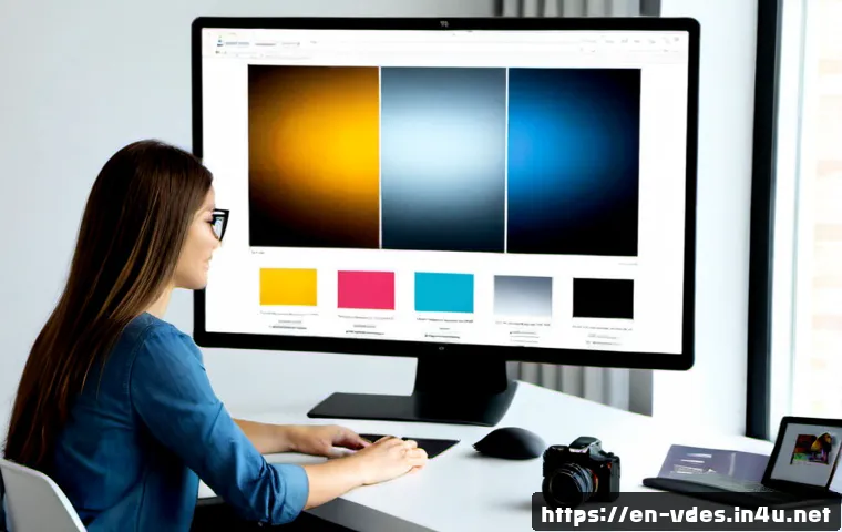
Ever scrolled through a stunning website or picked up an eye-catching magazine and thought, “Wow, that just feels right”? It’s easy to credit the vibrant colors or sleek layouts, but more often than not, the unsung hero quietly doing all the heavy lifting is typography.
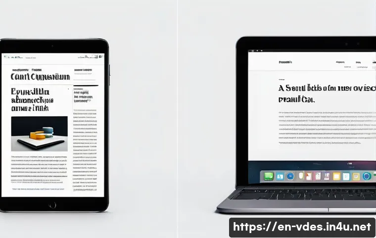
We sometimes forget that text isn’t just about conveying information; it’s a powerful visual element, a mood-setter, and a direct line to your audience’s subconscious.
Trust me, after years of diving deep into design, I’ve seen firsthand how a well-chosen font or a perfectly tweaked line height can transform an ‘okay’ design into something truly memorable.
In our super visual, fast-paced digital world, mastering typography isn’t just a nicety; it’s a non-negotiable skill for anyone serious about creating impact, whether you’re building a brand, designing a website, or crafting compelling social media content.
I mean, think about it: the fonts you choose speak volumes before a single word is even read, influencing everything from perceived trustworthiness to accessibility for millions.
It’s a dynamic art form that constantly evolves with new technologies like variable fonts and responsive design, making it more exciting than ever to explore.
So, if you’re ready to unlock the secret language of letters and make your designs truly sing, let’s explore the incredible world of typography in visual design together.
The Emotional Resonance of Typefaces
Understanding Font Personality
You know that gut feeling you get when you see a certain brand? The way some logos just scream “luxury” while others feel instantly “friendly” or “serious”? A huge part of that unspoken communication comes directly from the typeface. I mean, think about it – a delicate script font isn’t going to convey the same message as a bold, blocky sans-serif, right? It’s like choosing the right outfit for an important meeting; your font sets the tone before a single word is even processed. I’ve spent countless hours experimenting with different typefaces, and it’s truly fascinating how a simple switch can completely alter a viewer’s perception. From the curviness of a serif to the crisp modernity of a sans-serif, each typeface carries its own unique personality, whispering subtle cues to your audience. When I’m working on a new project, I always start by asking myself, “What feeling do I want to evoke?” Is it trustworthiness, innovation, comfort, or excitement? Once I nail that down, the font choices become much clearer. It’s not just about aesthetics; it’s about connecting on an emotional level, making your message resonate deeper and leaving a lasting impression on your audience. This silent language of letters is incredibly powerful.
Connecting with Your Audience on a Deeper Level
Beyond just aesthetics, the emotional impact of typography plays a crucial role in how your audience perceives your message and, ultimately, your brand. Have you ever noticed how certain news outlets consistently use serious, authoritative serif fonts, while children’s brands often opt for playful, rounded sans-serifs? This isn’t accidental; it’s a deliberate choice to align the visual tone with the intended message and target demographic. In my experience, understanding the psychological associations of different font styles can truly elevate your design from merely functional to deeply impactful. For example, a humanist sans-serif might convey warmth and approachability, perfect for a non-profit, whereas a geometric sans-serif could suggest precision and modernity, ideal for a tech startup. It’s about creating a harmonious experience where the visual language supports and amplifies the written content. When you manage to tap into these emotional connections through your typeface choices, your design transcends mere information delivery and becomes a truly persuasive and memorable experience for the user. It’s a subtle art, but one with immense returns in terms of engagement and brand loyalty.
Crafting Visual Hierarchy with Type
Guiding the Reader’s Eye Effortlessly
Ever landed on a webpage and immediately felt overwhelmed, unsure where to look first? Chances are, the typography wasn’t doing its job to guide your eye. This is where visual hierarchy comes in, and typography is your absolute best friend in achieving it. It’s all about making certain elements stand out more than others, creating a clear path for your readers to follow. I often tell my clients, “Don’t make your audience hunt for information; serve it to them on a silver platter.” This means using varying font sizes, weights, and styles to differentiate between headings, subheadings, and body text. When I first started out, I’d just pick a couple of fonts and call it a day, but I quickly learned that thoughtful layering is key. Bold headlines grab attention, slightly smaller subheadings break down complex ideas, and readable body text ensures the message is absorbed without strain. It’s a delicate dance, but when you get it right, the user experience dramatically improves, almost as if your design is whispering, “Look here first, then here.” This intentional structuring of information ensures that even complex content becomes digestible and engaging, reducing bounce rates and keeping visitors on your page longer, which is a win-win for everyone.
The Power of Contrast and Placement
Achieving effective visual hierarchy isn’t just about making things bigger or bolder; it’s also deeply tied to the strategic use of contrast and thoughtful placement within your layout. Think about how a powerful headline can immediately draw you in, while a well-placed sub-headline further entices you to read more. This isn’t accidental; it’s the result of carefully considered typographic relationships. I’ve found that experimenting with different levels of contrast – not just in size and weight, but also in color and even typeface style – can create a dynamic and engaging flow. For instance, a very light, airy body text might sit beautifully under a strong, heavy headline, creating a clear visual break. Furthermore, the amount of whitespace you give your typographic elements plays a massive role. Cramming text together, even with varying sizes, can still feel overwhelming. Giving your headings and paragraphs room to breathe allows each element to shine and makes the overall composition feel more refined and professional. It’s about creating a visual conversation with your audience, where each piece of text knows its place and contributes to the overall narrative, guiding them smoothly from one point to the next.
Responsive Typography for the Multi-Device World
Adapting Text for Every Screen Size
Remember the good old days when you just designed for a desktop screen? Yeah, neither do I! In today’s world, our designs have to look fantastic everywhere – on a giant monitor, a tiny smartphone, and everything in between. This is where responsive typography becomes less of a ‘nice-to-have’ and more of an absolute necessity. It’s not just about scaling down your text; it’s about optimizing it for legibility and aesthetic appeal across countless screen sizes and resolutions. I’ve personally torn my hair out trying to get that perfect balance, only to realize I needed to approach it with a flexible mindset from the get-go. Thinking responsively means considering line length, font size, line height, and even the choice of font family itself for different breakpoints. A headline that looks amazing at 60px on a desktop might be completely unreadable or take up too much space on a mobile device. It’s a constant balancing act, ensuring that your message is always clear and pleasant to read, whether someone is quickly glancing at it on a smartwatch or deeply engaging with it on a tablet. This adaptability is paramount for user satisfaction and ensuring your content reaches the widest possible audience.
Leveraging Flexible Units for Seamless Adaptation
To truly master responsive typography, you need to ditch rigid pixel values for your text and embrace more flexible units. This was a game-changer for me! I’ve found that using relative units like ’em’ or ‘rem’ along with viewport units (‘vw’ for width-based scaling) can be a real lifesaver. These units allow your text to scale proportionally to the user’s browser settings or viewport size, ensuring your typography is always appropriate and readable. For example, setting your base font size in ‘rem’ allows other elements to scale relative to that, creating a consistent and harmonious system. Media queries also become your best friend here, enabling you to make specific adjustments to font sizes, line heights, and even font stacks for different screen sizes. It’s about building a robust typographic system that gracefully adapts, rather than breaking, under various conditions. It ensures your text adapts fluidly, maintaining readability and impact no matter what device your audience is using. It’s a bit of a learning curve, but once you master it, your designs will feel so much more professional and user-friendly, and you’ll save yourself countless headaches trying to fix static text on tiny screens.
The Art of Pairing Fonts Like a Pro
Finding Harmony and Contrast in Combinations
Oh, the endless quest for the perfect font pairing! If there’s one area of typography that can feel like a dark art, it’s this. You want harmony, but not monotony. Contrast, but not chaos. It’s like finding the perfect partners for a dance – they need to complement each other, enhancing the overall performance without stepping on each other’s toes. I used to just pick two fonts I liked, cross my fingers, and hope for the best. Big mistake! What I’ve learned over the years is that successful font pairing often involves a thoughtful balance of differences. Maybe a strong, structured sans-serif for headlines paired with a more elegant, readable serif for body text. Or perhaps two sans-serifs with distinctly different weights or personalities. The key is to ensure they serve different functions in your hierarchy but still share an underlying aesthetic that makes them feel like they belong together. It’s about creating a visual conversation, where each font has its unique voice but contributes to a cohesive and appealing overall message. When you get it right, it feels like magic – the fonts just sing together, creating a cohesive and polished look that instantly elevates your design.
Practical Strategies for Effective Pairings
So, how do you actually go about finding these magical combinations? I always start by defining the primary and secondary roles of my fonts. One for headlines, one for body text, perhaps a third for accents or call-outs. Then, I look for fonts that offer a good contrast in one aspect (like serif vs. sans-serif, or bold vs. light) but share some common underlying characteristics, such as a similar x-height or historical origin. This creates that ‘familiar yet different’ dynamic that works so well. Another trick I often employ is using different weights or styles from the same super family; many modern typefaces are designed to work together seamlessly, offering a wide range of options within a single family. Tools like Google Fonts offer pairing suggestions, which can be a great starting point, but always, always test your pairings in actual content, not just isolated examples. Does the combination improve readability? Does it reinforce the brand’s message? Trust your eye, but also trust tried-and-true principles of contrast and complementarity. Ultimately, the best pairing is one that enhances your content without drawing undue attention to itself, making the reading experience smooth and enjoyable for your audience.
| Principle | Description | Why It Matters |
|---|---|---|
| Readability | The ease with which individual characters and words can be distinguished. | Ensures your message is absorbed effortlessly, preventing user fatigue. |
| Legibility | The overall ease of reading a larger block of text. | Crucial for user experience, especially with longer content and diverse audiences. |
| Hierarchy | Organizing textual elements to guide the reader’s eye through content. | Directs attention, highlights key information, and improves content flow. |
| Contrast | Differences in size, weight, color, or style between typographic elements. | Creates visual interest, defines relationships, and enhances accessibility. |
| Consistency | Maintaining uniform typographic styles across all elements and platforms. | Builds brand recognition, trust, and a cohesive user experience. |
| Whitespace | The empty space surrounding text, lines, and paragraphs. | Improves readability, reduces clutter, and gives elements room to breathe. |
Typography for Accessibility and Inclusivity
Designing for Everyone, Regardless of Ability
This is one aspect of typography that I truly believe every designer needs to prioritize, and honestly, it’s often overlooked. Designing with accessibility in mind isn’t just about ticking boxes; it’s about ensuring that everyone, regardless of their visual abilities, can easily read and understand your content. I’ve had conversations with users who rely on screen readers or have various visual impairments, and their insights have been eye-opening. What seems like a minor stylistic choice to us can be a significant barrier for others. Things like sufficient contrast between text and background colors, using clear and legible font faces, and ensuring generous line spacing and letter spacing are absolutely crucial. Don’t forget about font size – what’s readable for a 20-year-old on a bright monitor might be impossible for someone with presbyopia on a dimmer screen. It’s our responsibility as designers to remove these barriers, making the digital world a more welcoming and usable space for all. Thinking proactively about accessibility elevates the quality of your work and expands your audience reach, a win-win situation for both users and creators.
Key Considerations for Inclusive Type Choices
When you’re aiming for truly inclusive typography, there are a few non-negotiables to keep in mind. First, always ensure a high contrast ratio between your text and its background. Tools exist online to check WCAG compliance, and honestly, there’s no excuse not to use them. Second, choose typefaces that are inherently legible; fonts with overly thin strokes, extreme x-heights, or highly stylized forms can be very difficult for many to read. Sans-serifs are often favored for digital content due to their clarity, but well-designed serifs can also work beautifully. Third, pay close attention to line height (leading) and letter spacing (kerning). Text that’s too tightly packed becomes a dense block, while overly loose spacing can make words fall apart. I always make it a point to test my designs with accessibility tools and even ask friends with different visual needs to give me feedback. It’s about empathy, really. When you design for accessibility, you’re not just making your content available to more people; you’re also improving the experience for everyone. It makes your work more impactful and, frankly, it’s just the right thing to do. Accessibility isn’t an add-on; it’s an integral part of good design practice.
Boosting Brand Identity with Thoughtful Typography
Crafting a Unique Visual Voice
Your brand’s typography is far more than just a collection of letters; it’s a foundational pillar of your entire brand identity. It’s like the voice of your brand – do you want it to sound authoritative, playful, sophisticated, or approachable? The choices you make in fonts, their sizes, weights, and even how they’re arranged, all contribute to this perceived personality. I’ve seen brands completely transform their image just by refining their typographic system. It’s an investment, not an afterthought. When I’m helping a new company develop its visual identity, one of the first things we dive into is typography. We talk about their values, their target audience, and the overall message they want to convey. Then, we explore how different font families can embody those characteristics. This careful selection ensures that every piece of text associated with your brand consistently reinforces its core message and values. It’s a subtle but incredibly powerful way to communicate who you are without saying a word, leaving a distinct and memorable impression on your audience that goes beyond just words.
The Power of Typographic Consistency
Once you’ve poured your heart and soul into selecting the perfect fonts for your brand, the next, equally crucial step is consistency. Seriously, this cannot be overstated. Imagine seeing a brand use five different font styles across their website, social media, and printed materials. It would feel disjointed, unprofessional, and frankly, a bit confusing, wouldn’t it? Consistency is absolutely key here. Once you’ve established your brand fonts, stick to them across all your marketing materials, your website, social media – everywhere. This builds recognition and reinforces your brand’s unique presence in a crowded market. Each time someone encounters your brand, they should instantly recognize its visual voice, which typography plays a massive part in. This disciplined approach not only builds trust and professionalism but also strengthens your brand’s memory recall. It’s like having a consistent, recognizable voice that everyone remembers and associates specifically with you. A strong typographic identity is one of the most cost-effective ways to build lasting brand equity and ensure your brand always looks polished and intentional.
Common Typography Mistakes and How to Dodge Them
Avoiding the Pitfalls of Poor Font Choices
Even seasoned designers can stumble into a typography trap now and then, myself included! It’s easy to get carried away with all the fantastic fonts out there, but sometimes less is truly more. One of the most common pitfalls I see is using too many fonts in a single design. Seriously, stick to two or maybe three at most. Any more than that, and your design starts looking like a chaotic ransom note rather than a cohesive piece of art. It creates visual noise and confuses the reader, making your content harder to digest. Another big no-no is poor contrast. If your text is hard to read against its background, you’ve already lost your audience. I’ve learned the hard way that a beautiful font is useless if it’s invisible! Overly decorative fonts for body text are also a huge red flag; they might look cool for a headline, but they’ll quickly cause eye strain when used for long paragraphs. Always prioritize legibility and readability over fleeting trends or personal preferences when it comes to the main content. Trust me, your readers will thank you for it with increased engagement.
Fine-Tuning Spacing and Alignment for Professionalism
Beyond choosing the right fonts, the devil truly is in the details when it comes to typography. This means obsessing over the subtle nuances of spacing and alignment, which can elevate your design from amateur to professional. I’m talking about line spacing (leading), letter spacing (kerning), and paragraph alignment. Text that’s too tightly packed, either vertically or horizontally, feels cramped and can be incredibly difficult to read. Conversely, overly loose spacing can make words and lines feel disconnected, breaking the natural flow of reading. Adjusting these elements, even by tiny increments, can make a world of difference. I remember a project where I spent days tweaking these minute details, and the client couldn’t even pinpoint why, but they just said, “It feels so much better.” It’s those subtle adjustments that create a comfortable reading rhythm and improve overall aesthetics. Also, be mindful of alignment; unjustified text with ragged edges can be charming, but inconsistent alignment across different text blocks can look sloppy. Consistent, thoughtful application of these spacing principles is what truly separates good typographic design from truly great, impactful design that captures and holds attention.
The Future is Flexible: Embracing Variable Fonts
Unlocking Unprecedented Typographic Control
If you haven’t delved into variable fonts yet, you are in for a treat! This technology is genuinely revolutionizing how we think about typography, offering an unprecedented level of flexibility and control. Imagine having an entire family of fonts – from ultra-light to extra-bold, condensed to extended, italic to upright – all contained within a single font file. When I first started playing around with them, it felt like unlocking a secret cheat code for designers. Instead of loading multiple static font files, which can slow down your website and impact user experience, you load just one, and then you can infinitely adjust its weight, width, slant, and other optical properties. This not only significantly improves performance but also opens up a world of creative possibilities. You can create subtle typographic animations, perfectly match text to specific layouts, and ensure ultra-fine-tuned responsiveness across all devices. It’s truly a game-changer for responsive design, allowing for incredibly granular control without the performance hit. I’ve found that it significantly streamlines my workflow and allows for a much more dynamic and sophisticated typographic approach. This isn’t just a trend; it’s the future of typography, and getting familiar with it now will put you miles ahead of the curve in design innovation.
Performance and Creative Freedom Combined
Beyond the sheer aesthetic possibilities, one of the most compelling arguments for embracing variable fonts is their undeniable impact on performance. In an age where page load speed directly correlates with user retention and SEO rankings, reducing the number of HTTP requests and file sizes is paramount. Variable fonts achieve this by packing an entire spectrum of styles into a single, compact file, rather than requiring separate files for each weight or style. This means faster loading times, a smoother user experience, and ultimately, better engagement metrics. But it’s not just about speed; it’s about the creative freedom it affords. Imagine being able to fine-tune a font’s weight by just a few points to perfectly fit a headline into a tight space, or to subtly animate a text’s boldness as a user scrolls. The granular control is simply unparalleled. I’ve personally used variable fonts to create dynamic titles that adjust their width based on screen size, delivering a perfectly tailored aesthetic on every device. It allows for a level of precision and dynamism that static fonts simply can’t offer, enabling designers to push the boundaries of what’s visually possible on the web without compromising on performance. It’s truly the best of both worlds, empowering us to create richer, more responsive, and more engaging typographic experiences.
Wrapping Things Up
Whew, we’ve covered a lot of ground today, haven’t we? It’s truly incredible to see how deep the rabbit hole of typography goes and how every little decision, from a font’s personality to its pixel-perfect alignment, can dramatically shape the way our message is received. From my own journey, I’ve learned that typography isn’t just about making words look pretty; it’s about making them communicate effectively, resonate emotionally, and create an unforgettable experience for every single person who encounters your content. It’s a silent, powerful force in design, constantly working behind the scenes to build connections, guide eyes, and establish trust. I hope this deep dive has sparked some new ideas and encouraged you to look at text with fresh eyes, recognizing the immense impact it holds in our digital world.
Good to Know Info
Here are a few quick tips and valuable insights I’ve picked up over the years that can really elevate your typographic game and save you some headaches!
1. Always Check Font Licenses: Before using any font, especially for commercial projects, double-check its licensing terms. Many free fonts are great for personal use but require a paid license for commercial applications. A quick Google search for “[Font Name] license” usually clarifies things, and a few dollars spent upfront can save you a world of legal trouble down the line.
2. Optimize Web Fonts for Performance: Web fonts can sometimes slow down your site. To keep things zippy, use modern formats like WOFF2, only load the specific weights and styles you need, and consider subsetting fonts to include only the characters you’re using. Tools like Google Fonts also offer performance-optimized versions.
3. Leverage Online Pairing Tools: Feeling stuck on font pairings? Websites like Fontjoy, Typ.io, or even the pairing suggestions on Google Fonts can give you fantastic starting points. While your artistic eye is crucial, these tools can introduce you to combinations you might not have considered.
4. Utilize Accessibility Checkers: Make accessibility a priority! Use online contrast checkers (like WebAIM’s Contrast Checker) to ensure your text color against its background meets WCAG standards. This simple step makes your content readable for a much wider audience and shows you care.
5. Explore Variable Font Resources: If you’re ready for the next level, dive into variable fonts. Resources like Axis-Praxis or the Variable Fonts page on Google Fonts offer playgrounds and examples that showcase their incredible potential. Getting a handle on these now will keep your designs future-proof and incredibly flexible.
Key Takeaways
If there’s one thing I want you to walk away with, it’s that typography is a foundational art and science that absolutely demands our attention. We’ve explored its power to evoke emotions, how crucial it is for guiding your audience through content with clear visual hierarchy, and the non-negotiable need for responsive and accessible design in today’s multi-device world. Remember, thoughtful font pairings aren’t just about aesthetics; they’re about creating harmony and contrast that enhances readability and brand identity. We also touched upon the critical importance of avoiding common mistakes like using too many fonts or neglecting crucial spacing, and how embracing forward-thinking technologies like variable fonts can truly set your work apart. Ultimately, good typography isn’t just a design embellishment; it’s a silent communicator, a brand builder, and a user experience enhancer that can elevate your content from merely being seen to being truly felt and understood. Keep experimenting, keep learning, and trust your eye – you’ve got this!
Frequently Asked Questions (FAQ) 📖
Q: Why should I even care about typography if I’m not a “designer” by trade? Isn’t it just for the pros?
A: Oh, my friend, this is such a common misconception, and it’s one I love to debunk! While professional designers certainly master typography, thinking it’s only for them is like saying only chefs should care about good ingredients.
If you’re communicating anything visually – an email newsletter, a social media post, a presentation slide, or even just a resume – you’re using typography, and it’s shaping how your message is received.
Trust me, I’ve seen countless brilliant ideas fall flat because the text was an unreadable mess, or conversely, a simple message elevated to pure gold with the right font choices.
Typography is your silent salesperson; it sets the tone, builds trust, and literally guides your audience’s eyes through your content. A thoughtfully chosen typeface can instantly convey professionalism, playfulness, authority, or warmth before a single word is even processed.
When your typography is on point, your audience stays engaged longer, understands your message better, and is more likely to take action – which, if you’re like me, means more clicks, longer dwell times, and ultimately, better results for whatever you’re trying to achieve!
Good typography improves readability and accessibility, too. So, whether you’re a blogger, marketer, small business owner, or just someone who wants their words to make an impact, understanding typography is a superpower you absolutely need in your toolkit.
Q: How do I even begin to choose the right font when there are literally thousands out there? It feels so overwhelming!
A: I totally get it – opening up that font menu can feel like staring at a massive buffet when you’re not sure what you’re hungry for! After years of experimenting (and making my fair share of questionable font choices, trust me!), I’ve learned a few tricks.
The absolute first step is to define the “personality” and purpose of your project. Is it for a serious corporate report or a fun event invitation? A sleek tech brand or a cozy coffee shop?
The font you pick acts as the voice of your content, so you want it to match the mood you’re going for. Next, consider your audience and the medium. A playful, rounded font might be perfect for a children’s book, but completely inappropriate for a legal document.
And while serifs often shine in print for their readability in long-form text, sans-serifs usually perform better on screens due to their crispness and modern feel.
Don’t be afraid to keep it simple – often, a versatile sans-serif like Lato, Open Sans, or Roboto works wonders for digital body text. I usually stick to a maximum of two to three fonts per project to avoid a cluttered look.
One for headlines, one for body text, and maybe a third accent font for special call-outs. When pairing, aim for contrast – a bold serif with a simple sans-serif, for instance – to create visual interest without clashing.
And please, for the love of good design, avoid overly trendy or “fad” fonts that will quickly date your work or are hard to read; legibility should always be your top priority.
Q: Beyond just the font style itself, what other elements of typography should I pay attention to to make my designs truly pop?
A: Ah, this is where the magic really happens, and it’s what separates a good design from a truly captivating one! While choosing the typeface is foundational, typography is a whole ecosystem of elements working together.
The first thing I always tweak is , also known as leading. This is the vertical space between lines of text. Too tight, and your text becomes a dense, intimidating block; too loose, and it looks disconnected and floaty.
I’ve found that a sweet spot for body text on the web is often around 1.5 times the font size – it just lets the words breathe. Then there’s and , which are about the spacing between individual letters and overall letter spacing in a block of text, respectively.
Adjusting these can dramatically improve readability and visual appeal. I once spent an embarrassing amount of time adjusting the kerning on a client’s logo, but the difference it made was phenomenal; it just felt more polished.
is also crucial. Think about how you use different font sizes, weights (bold, regular, light), and even colors to guide the reader’s eye and emphasize key information.
Headlines should naturally stand out, subheadings should break up content, and body text should be inviting. And don’t forget – the empty areas around your text.
It’s not just empty space; it’s a powerful design tool that gives your typography room to shine and prevents visual clutter. It’s like the pause in a great song, giving everything more impact.
Paying attention to these subtle details is what transforms mere words into an engaging visual experience, keeping your audience hooked and making your content truly memorable.