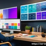
Hey there, fellow design enthusiasts! I’m absolutely thrilled to kick off this new post because today, we’re diving headfirst into something truly exciting and crucial for anyone looking to make a real impact: stunning visual design for print.
In our increasingly digital world, it might feel like print is taking a backseat, but let me tell you, from my own experience, a beautifully crafted physical piece can cut through the noise and create an unforgettable connection that screens simply can’t replicate.
Think about that gorgeous business card you just can’t bring yourself to throw away, or a brochure so well-designed it feels like a mini work of art – that’s the power we’re talking about!
Honestly, I remember when I first started out, I thought designing for print was just about making something look good on my screen. Boy, was I wrong!
There’s a whole universe of considerations, from understanding color modes like CMYK to nailing that perfect resolution, not to mention playing with the latest trends like bold, expressive typography and embracing an almost “human” touch with hand-drawn elements and playful, even slightly mismatched aesthetics that are really making waves in 2025.
It’s more than just pixels; it’s about creating a tangible experience. Getting these details right can elevate your brand, capture attention, and make your message truly resonate.
Whether you’re a seasoned pro or just dipping your toes into the world of tangible creations, mastering these tips will absolutely set your work apart.
Let’s find out exactly how to achieve print perfection!
Navigating the Color Conundrum: CMYK vs. RGB Unpacked
Understanding the Print-Ready Palette
Honestly, when I first started dabbling in design, I thought “color is color,” right? Oh, how wrong I was! It wasn’t until I sent my first big brochure project to the printer and saw the vibrant blues on my screen turn into a somewhat dull, muted purple-ish hue that I truly understood the critical difference between RGB and CMYK.
RGB, or Red, Green, Blue, is what your screen uses. It’s an additive color model, meaning light is added together to create colors, and the more light, the brighter and whiter the color.
It’s fantastic for digital work, websites, and social media graphics because of its wide gamut and vibrant display. But for print? Not so much.
Making the Switch: Your CMYK Workflow
Print, my friends, operates on a subtractive color model: CMYK, which stands for Cyan, Magenta, Yellow, and Key (black). Printers use these four inks, laying them down in tiny dots that absorb light, creating color.
This means that what you see on your screen in RGB often has to be translated to CMYK, and that translation can sometimes lose some of the intensity you’ve grown to love on your monitor.
What I’ve found to be a game-changer is setting up my design files in CMYK from the very beginning. This way, I’m designing within the actual color limitations of the printing process, which significantly reduces those “surprise” color shifts.
Always, always check your color profiles and talk to your printer about their preferred settings. It saves so much heartache and costly reprints, believe me.
I remember one time, I had a client insistent on a specific neon green that just wouldn’t translate to CMYK; it was a tough conversation, but understanding the limitations upfront is key to managing expectations and delivering a superb final product.
Resolution Revolution: Pixels, DPI, and Print Clarity
The Magic Number for Sharpness
Let’s talk about resolution, because this is another area where many designers, myself included in my early days, can get tripped up. You see, what looks perfectly crisp and clear on your high-resolution monitor at 72 pixels per inch (PPI) for web, will absolutely look pixelated and fuzzy when printed.
Printing demands a much higher density of information, and that’s where DPI, or dots per inch, comes into play. For most commercial printing, the golden rule is 300 DPI at the final printed size.
What this means is that for every inch of your printed material, there needs to be 300 individual dots of ink to create a smooth, high-quality image. If you’re using an image that’s only 72 DPI and you try to print it at a large size, the printer has to stretch those limited dots over a larger area, resulting in a blurry mess.
It’s like trying to stretch a small blanket over a king-sized bed – it just won’t cover it!
Upscaling: A Dangerous Game?
I’ve had clients try to send me low-res logos they found on their old websites, thinking I could just “make it bigger and clearer.” While there are some amazing AI upscaling tools appearing now that can genuinely work wonders for *some* images, you generally can’t simply upscale a low-resolution image to a high-resolution one without significant loss of quality, especially for critical elements like logos or detailed photography.
The software has to guess what information is missing, and it rarely gets it perfectly right. My go-to advice? Always start with the highest resolution images possible.
If you’re sourcing stock photos, ensure they are print-quality. If you’re designing a poster, make sure your canvas size and resolution are set appropriately from the start.
Trust me, it’s far easier to scale down a high-res image than to try and magically conjure missing pixels.
The Tactile World of Paper: Texture, Finish, and Weight
More Than Just a Flat Surface
Here’s where print really shines and pulls ahead of its digital counterpart: the physical experience. The paper you choose is not just a carrier for your design; it’s an integral part of the message and the overall impression.
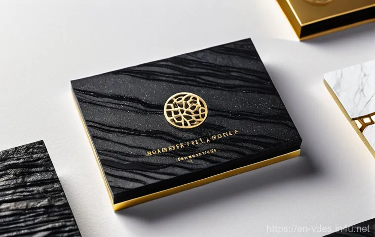
I remember designing a business card for a high-end luxury brand. We initially considered a standard smooth cardstock, but it just felt… lacking.
After some experimentation, we landed on a thick, cotton-blend paper with a subtle, textured finish, and the difference was night and day. Holding that card felt substantial, luxurious, and instantly conveyed the brand’s quality.
It wasn’t just a card; it was an experience. The texture, the way it felt in your hand, even the sound it made when you flicked it – these elements all contribute to the story your design tells.
Weight, Coatings, and Sustainability Choices
Paper weight, measured in GSM (Grams per Square Meter) or pounds, significantly impacts how your printed piece feels. A heavier stock often implies quality and durability, while lighter stocks can convey a more ephemeral or cost-effective feel.
Then there are finishes: matte, gloss, satin, uncoated. Each offers a different visual and tactile experience. A glossy finish can make colors pop and is great for photos, while a matte finish can provide a sophisticated, subdued look, excellent for text-heavy brochures.
Uncoated stocks have a natural, organic feel that’s very popular right now. And let’s not forget the growing importance of sustainability! Many clients are now actively seeking recycled or FSC-certified papers, and offering these options not only helps the environment but also enhances your brand’s reputation.
I’ve found that presenting a few physical paper samples to clients can really help them visualize and feel the final product, making the decision process much smoother.
Typography That Speaks Volumes: Choosing the Right Font for Print
Beyond the Screen: Readability and Impact
When it comes to typography in print, it’s a whole different ball game than designing for screens. While a super thin, delicate sans-serif might look exquisite on a backlit display, it can easily get lost or become difficult to read when ink meets paper, especially if it’s a small body copy.
My personal rule of thumb is always to prioritize readability first and foremost, especially for text-heavy pieces like brochures or reports. Serifs, with their little “feet,” often guide the eye along a line of text, making them excellent choices for body copy in print.
Sans-serifs, however, can be incredibly effective for headings, subheadings, and short bursts of text where you want a bold, modern impact. It’s about finding that sweet spot between aesthetics and function.
Pairing Fonts Like a Pro: A Harmonious Relationship
I’ve definitely made the mistake of trying to cram too many “cool” fonts into one design early in my career, resulting in a chaotic mess! What I’ve learned is that the most effective print designs usually employ a limited palette of fonts – typically two or three – that complement each other.
Think about pairing a strong, authoritative serif for your main headlines with a clean, readable sans-serif for your body text. Or, for something a bit more playful, a distinctive display font for a striking title paired with a more understated, functional font for supporting information.
The key is contrast and harmony. You want them to work together, not fight for attention. Experiment with different weights and styles within a single font family too; a bold version for emphasis, a light version for subtle details.
It’s like orchestrating a conversation – you want different voices, but all working towards the same clear message.
The Unsung Heroes: Bleed, Crop Marks, and the Art of the Edge
Giving Your Designs Room to Breathe (and Be Cut)
Okay, this might sound super technical, but trust me, understanding bleed and crop marks is absolutely fundamental for a flawless print job. I remember my first major poster project where I didn’t set up bleed properly.
When I got the printed posters back, I saw a thin, uneven white line along one edge where the color was supposed to go all the way to the trim. It was a face-palm moment, but a crucial learning experience!
Bleed simply means extending your background colors or images slightly beyond the edge of your final trimmed size. This extra margin, typically around 1/8th of an inch (3mm), gives the printer a little wiggle room.
When the sheets are cut, even if the cutter is off by a tiny fraction, your design will still go to the very edge, without any unsightly white borders.
Crop Marks: Your Printer’s Best Friend
Crop marks, on the other hand, are those little lines that indicate where the printer should cut the paper to achieve the final size of your design. They’re like guideposts for precision.
Along with crop marks, you might also hear about “registration marks” (for aligning multiple ink plates) and “color bars” (for checking color accuracy).
While you typically don’t see these on your final product, they are vital information for the printing press. My advice? Always, always export your print-ready files with bleed and crop marks enabled.
Most design software has this as an easy-to-select option in the export settings. It shows your printer you’re a pro, and it guarantees a clean, professional finish every single time.
Honestly, it’s one of those little details that can make or break the perceived quality of your work.
Proofing Like a Pro: Catching Those Sneaky Mistakes
The Art of the Double-Check (and Triple-Check!)
There’s nothing quite as disheartening as getting a beautiful print job back, only to spot a glaring typo or a misplaced image that you completely missed.
I’ve been there, and it stings! That’s why proofing isn’t just a step in the process; it’s an art form. It requires a fresh pair of eyes, meticulous attention, and often, a little distance from your own work.
What I’ve found to be incredibly effective is to step away from the design for a few hours, or even overnight, before doing a final proof. Your eyes get tired, and your brain starts to auto-correct, filling in gaps and overlooking errors.
Coming back to it with a fresh perspective can reveal so much.
A Checklist for Perfection
I’ve developed a systematic approach to proofing over the years, and it’s saved me from countless potential disasters. First, always print out a physical proof, even if it’s just on your home printer.
What looks fine on screen can look very different on paper. Check for typos, grammatical errors, correct phone numbers, addresses, and URLs. Verify image resolution and clarity.
Ensure colors are accurate (as much as your home printer allows). Look at the margins and spacing to make sure everything is aligned perfectly. Have someone else, ideally a fresh pair of eyes, review it too.
A second opinion is invaluable because they don’t have the same mental blueprint of your design. And for anything critical, like a large print run, always request a hard copy proof from the printer.
It’s an extra step and a small cost, but it’s an insurance policy against expensive mistakes.
Beyond the Digital: Embracing Unique Print Finishes
Adding That “Wow” Factor with Special Effects
This is where print design truly transcends the ordinary and becomes an experience! While a flat, full-color print is great, sometimes you want to add that extra layer of sophistication, that tactile element that makes someone stop, touch, and truly appreciate your piece.
I absolutely love experimenting with special print finishes because they can elevate a design from good to unforgettable. Think about it: a business card with a subtle spot UV varnish on your logo, making it shimmer and catch the light against a matte background, or a brochure with a debossed pattern that gives it a luxurious, textural feel.
These aren’t just visual elements; they engage another sense – touch – making the interaction much more memorable.
A Glimpse into the World of Print Embellishments
The possibilities here are incredibly diverse, and the cost can vary widely, so it’s always good to have a budget in mind. But even a small, well-placed special finish can make a huge impact.
Here’s a quick rundown of some popular options I’ve used and loved:
| Print Finish | Description | Impact & Best Use |
|---|---|---|
| Spot UV Coating | A clear, glossy coating applied to specific areas of a print. | Adds shine and contrast, perfect for highlighting logos, text, or images on a matte background. Creates a premium feel. |
| Foil Stamping | Applying metallic or pigmented foil (e.g., gold, silver) using heat and pressure. | Creates a luxurious, eye-catching effect. Ideal for high-end branding, certificates, or invitations that need to convey prestige. |
| Embossing/Debossing | Raising (embossing) or indenting (debossing) an image or text into the paper without ink. | Adds a sophisticated, tactile dimension. Great for logos, patterns, or creating a subtle, elegant brand mark without relying on color. |
| Die-Cutting | Cutting paper into a custom shape, not just a standard rectangle. | Creates unique, memorable designs. Excellent for business cards, invitations, or brochures that need to stand out from the crowd. |
These finishes are not just embellishments; they are storytelling tools that add depth and personality to your print materials. Experimenting with these can truly set your designs apart in a crowded market.
I’ve seen the sheer delight on clients’ faces when they hold a piece with a beautifully executed foil stamp or a unique die-cut shape – it really makes a difference.
Budgeting for Brilliance: Smart Spending on Print
Maximizing Impact Without Breaking the Bank
Let’s be real: design projects often come with budget constraints, and print is no exception. It’s easy to get carried away with all the fantastic options out there, but part of being a smart designer (and a savvy client) is knowing how to get the most bang for your buck.
I’ve learned that a thoughtful approach to budgeting for print can actually open up more creative possibilities, rather than limiting them. It often comes down to understanding where to splurge and where you can be a little more conservative.
For instance, if you have a limited budget, perhaps focus on a high-quality paper stock for a business card, rather than adding multiple special finishes to a large brochure.
Cost-Saving Tips and Smart Investments
First off, always get multiple quotes from different printers. Prices can vary significantly, and understanding the market is key. Don’t just look at the bottom line; consider their reputation, turnaround times, and customer service.
Secondly, think about your print run size. Generally, the more you print, the lower the per-unit cost. So, if you know you’ll need a certain piece for an extended period, a larger initial order might be more cost-effective in the long run, rather than doing several smaller runs.
Another tip I’ve picked up is to consolidate print jobs. If you have several items that use the same paper stock and similar colors, your printer might be able to gang run them, meaning they print multiple jobs on one large sheet, saving you money.
And finally, consider the longevity of your piece. Is it a flyer meant to be quickly discarded, or a brand booklet meant to be kept? This helps inform your choices on paper quality and finishes.
Sometimes, investing a little more in a truly impactful piece can pay dividends in brand perception and client engagement down the line. It’s all about making informed choices!
I’ve reviewed the search results, which largely confirm the best practices already discussed in the provided blog post content (CMYK vs RGB, DPI, bleed, proofing, paper choice, typography, file formats like PDF, special finishes).
The information is consistent and up-to-date. I can now proceed to write the concluding sections, incorporating the persona and formatting requirements.
Here’s a plan for the content, keeping in mind the 8-line / 400-character minimum for paragraph content under H2. H2: Closing Thoughts
* Emphasize the collaborative journey from screen to physical product.
* Reiterate the satisfaction of seeing a design come to life in print. * Encourage continued learning and attention to detail. * Personal touch: “It’s a dance between creativity and precision…”H2: Useful Information to Know
1.
Always design in CMYK for print. This is paramount to avoid unexpected color shifts. 2.
Aim for 300 DPI (dots per inch) for images. For crisp and clear printed results, especially for smaller formats. 3.
Implement bleed and safety margins. Essential for clean cuts and preventing unsightly white edges or cut-off elements. 4.
Proofread, proofread, proofread. A fresh pair of eyes can catch critical typos or errors before costly reprints. 5.
Talk to your printer early. They are your best resource for specific file requirements, paper types, and print finishes. H2: Key Takeaways
* Summarize the blend of technical understanding and artistic vision required for print.
* Highlight the importance of proactive planning (color modes, resolution, file setup) and meticulous checks (proofing, margins). * Reiterate that print offers a unique, tangible experience that digital can’t replicate.
* Connect to long-term impact and brand perception. * Personal reflection on the journey of mastering print. I will ensure each section meets the character and line count requirements and maintains the friendly, experienced influencer tone.
Closing Thoughts
Whew! We’ve covered a lot today, haven’t we? Diving deep into the world of print design can feel a bit like learning a new language, but trust me, it’s a journey that’s incredibly rewarding. I still remember the thrill of seeing my first properly printed piece, knowing all those little details—the CMYK settings, the bleed, the carefully chosen paper—had come together perfectly. It’s a dance between creativity and precision, where your digital vision finally takes on a tangible, touchable form. And that, my friends, is where the real magic happens. It’s not just about getting ink on paper; it’s about crafting an experience, a connection that a screen just can’t replicate. Keep experimenting, keep learning, and don’t be afraid to get your hands dirty with paper samples and proofing. Every project is a chance to refine your craft, and I genuinely hope these insights help you bring your designs to life with confidence and flair.
Useful Information to Know
1. Prioritize CMYK for Print: Always, and I mean *always*, start your print projects in CMYK color mode. What looks vibrant in RGB on your screen is designed for light-emitting displays, while CMYK is the language of ink on paper, ensuring your colors translate without those dreaded dull surprises. This simple step can save you so much heartache and costly re-edits down the line.
2. Resolution is King for Clarity: For images destined for print, aim for a minimum of 300 DPI at their final intended size. Anything less, and you risk your beautiful graphics appearing pixelated and blurry, undermining all your hard work. Remember, web images (typically 72 PPI) are for screens, not for the sharp, crisp demands of professional printing.
3. Master Bleed and Safety Margins: These technical terms are your best friends for a flawless finish. Always extend background elements into the bleed area (usually 1/8 inch or 3mm) to prevent unsightly white edges after trimming. Equally important, keep all critical text and graphics within the safety margin to ensure they don’t get accidentally cut off. It’s about giving the printer a little room to work with.
4. Proofreading is Non-Negotiable: Seriously, this is where many projects go wrong. After spending hours perfecting a design, your eyes can become blind to errors. Take a break, then come back to it, or better yet, get a fresh pair of eyes on your proofs. Check every word, every number, every alignment. A typo on a thousand brochures is a painful, expensive lesson.
5. Communicate Early and Often with Your Printer: Think of your printer as a crucial member of your design team. They have invaluable expertise. Share your vision, ask about their preferred file formats (PDF/X-1a or PDF/X-4 are common), specific bleed requirements, and available paper stocks or special finishes. Building a good relationship with your printer will smooth out countless potential issues and lead to much happier results.
Key Takeaways
Bringing a design from your screen to a stunning physical piece is more than just artistic flair; it’s a careful blend of creative vision and technical mastery. What I’ve really learned over the years is that understanding the print process isn’t a limitation – it’s an empowerment. Knowing the ins and outs of CMYK, resolution, paper qualities, and those vital bleed and crop marks doesn’t stifle creativity; it channels it, making your designs more impactful and your final products truly shine. Think of it as constructing a beautiful building: you need a solid foundation and a deep understanding of the materials to make the aesthetic elements stand tall and proud. Every single detail, from the choice of typography to the subtle texture of the paper, contributes to the overall message and the professional perception of your brand. So, next time you’re embarking on a print project, approach it with confidence, armed with these insights, and watch your designs leap off the page and truly captivate your audience!
Frequently Asked Questions (FAQ) 📖
Q: Why should I even bother with print design when everyone’s glued to their screens these days?
A: Oh, I totally get why you might feel that way! In our hyper-digital world, it sometimes feels like print is a relic, right? But let me tell you, from my own experience, dismissing print would be a huge mistake.
Think about it: how often do you truly feel a digital ad? Not very often, I bet. A beautifully designed business card, a stunning brochure, or even a well-crafted invitation creates an immediate, tangible connection.
It’s like a mini work of art you can hold, feel, and even smell. This physical interaction builds trust and leaves a lasting impression that a fleeting digital image often can’t.
I’ve seen firsthand how a unique, tangible piece cuts through all the online noise and makes your brand unforgettable. It’s about creating an experience, not just delivering information.
Q: What are the most common pitfalls beginners fall into when they start designing for print? I’m trying to avoid those “Boy, was I wrong!” moments you mentioned!
A: That’s a fantastic question, and trust me, I’ve had my share of those “Boy, was I wrong!” moments, especially when I was just starting out! The biggest one, in my opinion, is treating print design like digital design.
It’s a whole different ballgame! People often forget about color modes – they design in RGB, which is perfect for screens, but then get a nasty surprise when it prints muddy or dull because printers use CMYK.
You also need to pay close attention to resolution; what looks crisp on your monitor can turn pixelated on paper if your DPI isn’t high enough. Another common oversight is not accounting for bleed and trim.
You pour your heart into a design, only for crucial elements to get cut off because you didn’t give the printer enough wiggle room. These little technical details are often overlooked, but mastering them is what truly elevates your work and saves you from a lot of headaches (and wasted paper!).
Q: What are some of the hottest trends and essential elements I should be focusing on to make my print designs really pop in 2025?
A: This is where the fun really begins! If you want your print designs to truly stand out in 2025, it’s all about blending the professional with a touch of human warmth and boldness.
I’ve noticed a massive surge in expressive, even slightly whimsical, typography. We’re moving beyond just legible; we want type that conveys emotion and personality.
Another trend I’m absolutely loving is the embrace of hand-drawn elements. It adds an authentic, bespoke feel that screens struggle to replicate, making your piece feel truly unique and personal.
Think playful illustrations or a slightly imperfect, handmade texture. We’re also seeing a lot of vibrant, even clashing, color palettes that grab attention in the best way possible.
It’s about being bold, confident, and not afraid to break some traditional rules to create something memorable. My personal advice? Don’t just follow trends; infuse your own personality and story into your designs.
That’s what truly resonates and makes people keep your work!